
Out to Launch | Digital Game
Tools: Unity, Figma, Clip Studio Paint, Miro
Skills: UX Research, Graphic Design, UI Design, Game Design
Overview
I worked as part of a team to design and research a gameplay mechanic for the final project of my game design course in fall 2021. I designed the user interface and all assets for the planets, paths, and aliens. I also wrote the interview script and led task-based semi-structured interviews to determine the impact of our game mechanic on user experience. I then discussed the interview data with my team and used the themes found to identify actionable ways to improve user experience.
The final report and interview script is available here, and you can play the most recent version of the game, interview version 1, or interview version 2 on itch.io using the password “DAC305”.
Making a Mechanic
The first half of this project was creating a game that implemented a unique game mechanic. Since this was a group assignment, we conducted a brainstorming session using the “rapid ideation” method to determine what type of mechanic to create.
After discussion and refinement, the “lookahead mechanic” was born: ”Game objects change every turn, with an overlay of what change is coming next turn”. I created the following informative graphics in Miro to explain the lookahead mechanic in more detail.


Definitely Not a Game Jam
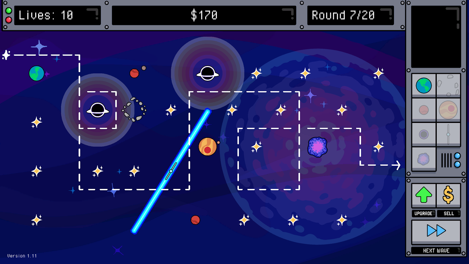
A mechanic isn't worth much without a game to go with it. When applied to a tower defense game, the idea is that the path changes randomly every few rounds, with the lookahead mechanic showing a preview of the upcoming path. Since players can only build towers on certain spots, they need to consider the paths enemies will take and whether their tower setup will still be effective when the path changes.
Since the timeline was extremely short, my first design for the UI was simple but functional. With no time to waste, I then jumped over to designing the research portion of the project.
Goal: Determine the impact of the lookahead mechanic on player strategy and enjoyment
Research Targets
I decided to start the interview script with preliminary questions to assess the participant's familiarity with tower defense games and their opinion on chance elements in games. The question on chance was especially important since the lookahead mechanic is also meant to offset the “unfairness” that players can feel with chance elements.
I then decided the best way to explore our research questions was to have the main part of the interview be task-driven and use two different versions of the game—one with lookahead and one without. After the tasks, I created questions for a semi-structured interview with the participant about their thoughts on the mechanic and their experience with the two versions of the game.
Data Analysis
All the interview notes were organized based on the AEIOU framework, which were then further categorized into six areas: UI, towers, game difficulty, paths, clarity, and user experience. These categories informed the ten key issues with the game I discussed in the final report.

Participants responded positively to the lookahead mechanic, and all of the feedback revolved around the UI and user experience. Some were caused by a complete lack of information (issues 3, 4, 8, 9, and 10), some were caused by poor user interaction patterns (issues 1, 2, and 7), and some were caused by unclear visual design (issues 5 and 6).
Goal: Describe clear and actionable ways to address each of the ten issues
Improving Interaction
I first started with the interaction issues. The UI had an unintuitive design pattern where players had to select a tower and then hover over a build point to even see how much a tower cost. This also contributed to players not knowing if they had enough to buy a tower or not.
To solve this, I redesigned the UI to move the tower price to the top next to the player's total currency, and modified the interaction pattern so that price was immediately shown to players on button hover, rather than forcing them to try and build a tower first.


Preparing for Takeoff
I also needed to address areas that were completely missing information, such as the vague tower keywords, invisible tower stats, and icon-only panel buttons. These issues were partly influenced by the tiny text area of the original UI. To solve this, I made the text box larger to fit the keywords and stats and added labels underneath the “upgrade”, “sell”, and “next wave” buttons.
Finally, I also addressed the two visual issues—unclear path intersections and tower point markers conflicting visually with other objects—with minor redesigns to their graphic elements. These can be seen in the examples below with the changed dash patterns at intersections and smaller star icons for better visual hierarchy.


Final Product
The team implemented the UI changes in the final version of the game. Casual feedback indicates much better user interaction and that the added details improve the gameplay experience.
Next Steps
While it has come a long way, there are still areas of the game to improve. The next steps forward would be to add a tutorial at the beginning and tooltips to explain additional information such as enemy abilities and hints.